Caitlin Donahue

Microsoft Clarity

Microsoft Clarity redefines how businesses understand user behavior and create meaningful experiences. The recent redesign of Clarity goes beyond visual appeal, introducing a workspace meticulously tailored for usability and personalization. By prioritizing intuitive navigation and consistent design, this upgrade empowers users to optimize their products and build experiences that truly resonate.


DURATION
6 months

ROLE
Lead UX/UI Designer, Creative Director

TEAM
Developers, Product Managers, Researchers


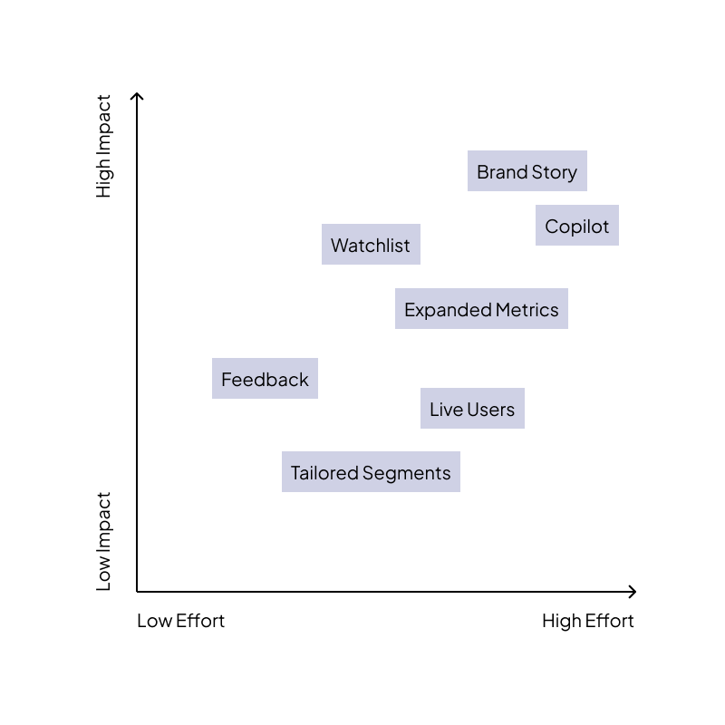
DESIGN CHALLENGE: Design a platform that makes behavioral analytics accessible to everyone. The experience should be user-friendly & enjoyable to use.

USER PROBLEM: Empower non-technical stakeholders, business users and analysts to easily understand and leverage behavioral insights, enhancing their decision-making capabilities.

RESULTS: The rebrand resulted in an impressive 11% increase in user reengagement and a 12% boost in user sign-ups. Both internal teams and external users have provided overwhelmingly positive feedback, highlighting the success of the new brand identity.

Discovery phase

Before its redesign, Microsoft Clarity embodied an enterprise-grade approach, offering robust analytics with detailed data visualization tailored for technical users. However, its complexity sometimes posed challenges for everyday website owners seeking intuitive insights. The transformation to a more consumer-grade design focused on accessibility, simplicity, and visual clarity.

Understanding opportunities

Competitive analysis revealed Microsoft Clarity's distinct position in the website analytics landscape. While enterprise-grade tools prioritized deep technical customization and premium-tier features, Clarity stood out for its ability to offer advanced session recording and heatmaps in a free, accessible format. However, compared to consumer-grade alternatives, Clarity had opportunities to refine its usability—particularly in simplifying navigation, enhancing onboarding for new users, and delivering more intuitive data visualization. Understanding these gaps helped shape Clarity’s redesign, ensuring it evolved into a tool that balanced powerful analytics with user-friendly functionality for a broader audience.

Site mapping

Before redesigning Microsoft Clarity, I knew that understanding user flow was essential to creating a more intuitive experience. By building a comprehensive site map, I was able to visualize how users moved through the platform, pinpointing areas where navigation felt cumbersome or unclear. This process allowed me to identify opportunities to streamline interactions, eliminate friction points, and guide users seamlessly to key insights.

Brand Perception Research

In the brand perception research conducted for Microsoft Clarity, we engaged customers directly to understand their feelings about the product and invited them to choose words that best described the brand. To gain a comprehensive perspective, we extended this approach to analyze our competitors, allowing us to gauge how Microsoft Clarity stacks up in the marketplace and uncover areas for differentiation. Internally, we took a reflective approach by involving our own team in a similar exercise, exploring how we perceive our brand's current position and envisioning where we aim to go. This holistic analysis provided valuable insights not only into customer sentiment and competitive standing but also into opportunities to refine and enhance our product. By carefully evaluating feedback, we identified areas for improvement to better meet user needs. Additionally, these findings enabled us to create detailed personas that represent key user groups, helping us design targeted solutions and communication strategies that resonate more deeply with our audience. This integrated process has been instrumental in shaping a roadmap for growth and innovation.


Define phase

In this stage of Microsoft Clarity’s redesign, we focused on shaping a clear direction by distilling user insights into actionable opportunities. We crafted “How Might We” statements to frame challenges in an optimistic and solution-oriented way, ensuring our approach fostered innovation rather than constraints. Prioritization was key, so we leveraged an impact/effort matrix to evaluate potential features—balancing the value each improvement would bring against the resources required to implement it. This method allowed us to outline deliverables and refine scope strategically, ensuring we focused on high-impact changes that would make Clarity more intuitive and accessible while remaining feasible within development constraints.

How might we…

…make behavioral analytics more intuitive for beginners?

…simplify the onboarding process for first-time users to make Clarity more accessible?

…enhance visualizations to help users quickly identify problem areas on their websites?

…tailor insights and recommendations based on individual user behavior patterns?

…allow users to customize their dashboards to focus on metrics most relevant to them?

…incorporate machine learning to predict user needs and offer personalized solutions?

Develop phase

I leaned into rapid exploration to uncover the best possible user experience. I started by creating moodboards, pulling inspiration from industry trends, intuitive design principles, and user expectations to define a cohesive visual direction. From there, I embraced the "mild to wild" approach—iterating through designs that ranged from subtle refinements to bold reinventions. This method allowed me to push creative boundaries while staying grounded in usability needs. By quickly cycling through ideas and testing different design extremes, I was able to refine concepts efficiently and ensure the final experience felt fresh, accessible, and impactful.

Research

To enhance user experience, we recognized the need to simplify our navigation, which was previously three levels deep and significantly pushed the content down. I conducted usability testing comparing a side navigation (side nav) with a top navigation (top nav). While the side nav appeared more modern, it ultimately proved less usable. Users preferred the top nav, as they appreciated having the words associated with the icons, which made navigation more intuitive and accessible.

Improving UI & features

In our quest to improve the user interface, we focused on creating a usability-centered design that is both simple and intuitive. By leveraging the principles of Fluent Design, we ensured a cohesive and familiar experience while infusing our own unique elements of delight. These custom touches added dimension and visual interest, enhancing the overall user experience without compromising on simplicity and functionality.

Design Highlight:

The Live Users feature in Microsoft Clarity allows you to monitor the number of users actively browsing your website in real time. This helps you analyze immediate engagement and detect any issues, ensuring an optimal user experience.


Design Highlight:

The redesigned dashboard cards in the update feature enhanced personalization, allowing users to tailor the display to their preferences for a more intuitive experience. Additionally, smart grouping organizes related data efficiently, making insights easier to interpret and act upon.

Clarity After

The final designs for Microsoft Clarity were the result of a deeply user-centered design process that I spearheaded from start to finish. I led the team through iterative cycles of research, ideation, and refinement—always prioritizing the needs of our users. By conducting extensive surveys and usability testing, I gathered direct feedback that shaped every aspect of the redesign, ensuring that Clarity evolved into a more intuitive and accessible tool. I guided the team in translating insights into meaningful design decisions, balancing innovation with practicality to create a seamless experience. This dedication to user advocacy allowed us to deliver a rebrand that was not only visually compelling but genuinely impactful in how users interact with and derive value from Clarity.

User Success

Users have found the redesigned Microsoft Clarity to be more intuitive and accessible, allowing them to effortlessly analyze website interactions and make data-driven improvements. By simplifying navigation and enhancing usability, we empowered a broader audience to leverage advanced analytics without the complexity of enterprise-grade tools.

Business success

From a business perspective, the redesign drove measurable success, leading to an 11% increase in user reengagement and a 12% boost in user sign-ups. This strategic shift not only aligned with company goals but also reinforced Clarity’s value as a user-first analytics solution.