Caitlin Donahue

Discover Cash into Checking

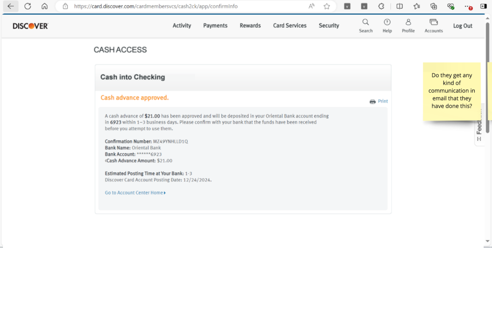
Cash Into Checking empowers Discover cardmembers to access funds when they need them most—directly into their checking account. This new feature brings a unique spin on cash advances by allowing users to deposit money from their available credit line straight into checking, giving them more flexibility in emergencies or tight financial moments. My role focused on extending this web-based feature into the mobile app, ensuring a frictionless, transparent experience that built trust and encouraged usage.


DURATION
3 months

ROLE
Lead UX/UI Designer

TEAM
Developers, Content Strategists, Product Manager


DESIGN CHALLENGE: Create a mobile-first experience that makes cash advances feel simple, safe, and easy to understand—without pushing users into high-interest decisions.

USER PROBLEM: Customers in financial need often don’t have savings to tap into and are unaware this option exists. They needed a clear, self-service way to access funds quickly, without confusion or frustration.

RESULTS: The enhanced mobile experience helped differentiate Discover from competitors and aligned with users’ preferred channels. Early testing showed strong comprehension and intent to use, with projected annual volume increases of $30MM in additional profit.

Discovery phase

I audited the existing web-based cash advance experience to identify friction points in the user journey—ranging from outdated page design to lack of contextual guidance. Through competitive analysis and stakeholder alignment, we uncovered a key opportunity to modernize the experience, improve comprehension, and bring the feature into mobile, where users increasingly expect fast, intuitive access to financial tools.

Understanding opportunities

Competitive analysis showed that Bank of America was the only major competitor offering a similar cash advance into checking feature, giving us a valuable benchmark for comparison. Reviewing their flow helped us identify opportunities to improve on clarity, reduce cognitive load, and streamline the mobile experience. By focusing on a more transparent, user-friendly journey, we aimed to position Discover’s offering as the more intuitive and trustworthy option.

Define phase

In the define phase, I worked closely with product and strategy partners to align on goals, outline the timeline, and establish clear milestones for delivery. I reviewed existing customer insights, internal research, and servicing data to better understand user pain points—particularly around urgency, confusion about fees, and lack of awareness of the feature. This groundwork helped us clearly define the core user needs: access to quick funds, confidence in the process, and a frictionless mobile experience.

Timeline

The project had an aggressive timeline driven by business goals, requiring close coordination across design, product, content, and engineering. I worked closely with cross-functional partners to define a phased approach that prioritized core functionality first, allowing us to meet deadlines without compromising the user experience.

Develop phase

I began by creating low- to mid-fidelity wireframes to explore key interaction points, focusing on clarity, trust, and ease of use. Walking through the flow with product, content, and engineering partners helped surface questions early and ensured alignment before moving into high-fidelity design. As the flow took shape, I continued refining the experience through iterative feedback and worked closely with the design systems team to ensure consistency, accessibility, and scalability across mobile.

Wireframes

I created wireframes to visualize the end-to-end user flow, helping the team clearly see how users would navigate the experience. Outlining the flow early allowed us to simplify complex decisions and surface questions around edge cases, copy, and technical constraints before investing in high-fidelity design. This upfront clarity streamlined collaboration and set a strong foundation for iterative improvements.

Brand systems

To maintain consistency and efficiency, I built the experience using Discover’s existing design library and component system. Leveraging these resources allowed for faster execution and ensured alignment with brand standards across mobile platforms. I also partnered with the design systems team to validate component usage and flag any gaps or needed adjustments.

Deliver

As we moved into delivery, I created a detailed legal review deck to document the user flow, copy, and key decision points for compliance approval. I also annotated final designs to clearly communicate functionality, behavior, and content details for our development partners. From there, I collaborated closely with engineers to answer questions, adjust to technical constraints, and ensure the final build matched design intent. This hands-on support continued through QA to help deliver a polished, trustworthy experience.

User Success

User testing indicated strong comprehension, trust, and ease of use, with participants navigating the flow confidently and without major friction. Feedback confirmed that the experience felt straightforward and reliable—key indicators of success ahead of full production rollout.

Business success

From a business perspective, the project aligned closely with strategic goals and showed strong early indicators of success. Stakeholders were highly supportive, and initial projections estimated a $30MM in additional profit—signaling strong potential impact even before launch.

Video Block
Double-click here to add a video by URL or embed code. Learn more