Clarity
Migraines hurt. A lot. And figuring out your own triggers can be stressful and overwhelming.
As a migraine sufferer myself, I have struggled to find what causes my migraines and have tried out many ways to track them. But everything I have used is too in depth or too surface level.
Clarity came from the feeling of relief when you discover a migraine trigger. The fog of mystery clears for a moment and a sense of control is felt.
As part of a User Experience Design class, I worked as the researcher, designer, and director for this project. My goal was to create a platform that helped users take some of the mystery out of their migraines. Prodded them to track their attacks with useful information. As well as prompted insights that might be the cause of their pain.
I used Principle, along with Sketch, InVision and other Adobe CC programs to create my user flows and live mockups.

Problem Statement & Hypothesis
Migraine sufferers need a way to identify their triggers because they want to alleviate their pain.
We believe that by prompting insights for migraine sufferers, we will achieve more trigger discoveries.
Discoveries from User Research
Users can remember their very first migraine
Triggers can be identified but tricky to do so
Migraines have a wide variety of symptoms and predromal symptoms
F**k Excendrin
““Life is marked by headache days and non-headache days.””


Visual Identity
The identity started with blues and purples to convey a medical feel, but with enough saturation to also feel fun and approachable. I integrated a darker background so those triggered by light would be able to use Clarity even during an attack. Balancing the dark blue with layers of gradient and abstract shapes gives the user a flowing experience as they move through the app.
I wanted to use clean illustrations and iconography for triggers and symptoms so the user would be able to recognize them easily. While the items are distinguishable, they are streamlined enough to not be distracting.

Encouraging but not pushy
Clarity is there as a tool for the user. Not to be their doctor, but to assist the user in discovering how to alleviate their pain. To be friendly and approachable but also trustworthy and reliable.
Migraine Logging
Clarity will walk you through steps to record an attack. The goal is to get a lot of information without being overwhelming and annoying.

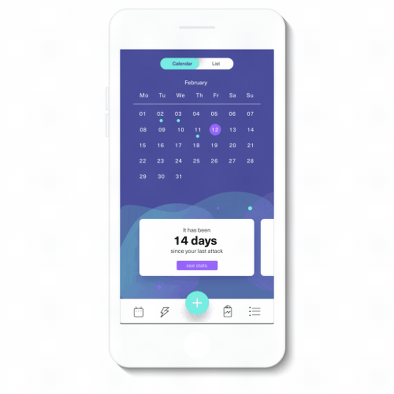
Personalized Data
The home screen shows you what triggers you know as well as gives you suggestions of possible triggers that you can track. Each user is presented with statistics and graphs on their migraines that they could then take to a doctor if needed.
““I haven’t eaten a tuna fish sandwich in a year and a half.””